1. What do you associate with the name (masthead) of the magazine?
Pop punk
Old fashioned music
Retro music/ individual/ fun
Music
Music bands- latest trends in music
Young people
Music and dance/ lively/ pop art
Vinyl music/ older music
A music box
Music
These results tell me that my target audience asssociate 'Jukebox' with music, the younger generation mixed with some retro music which was the main aim, so created a represntative magazine name.
2. What does the main image on the cover make you think of?
Pop punk/ interview with Emma
Mayhem/ chaos
Wild/ fun
A crazy girl
Partying/ artist information
Emma's Story
Young people enjoying themselves
Crazy artist
People having fun
Mad
The results mainly show that my target audience think of things like 'crazy' when they look at the cover image which is the look I wanted to achieve so that it represnted the content being 'wild' and 'fun'.
3.Which of the cover stories do you think is most interesting?
Concert information: 2
Interview with Emma: 4
Top 50 songs of the year: 4
I think these three cover stories got the most votes as they stood out more on the cover and seemed more interesting to find and read.
4. Is the front cover appealing?
Yes: 9
No: 1
Well laid out
Looks fun/ catches eye
Clear/ fun/ colourful
Doesn't like music
A lot of info but not overcrowding
Vibrant and fun
Makes you want to read the magazine content
Lots of info/ appealing colour scheme
Stands out
Catches your eye/ looks fun
Results show that my target audience think that the cover is appealing because of its fun look achieved by the colour scheme and the picture.
5. Which of the following age group do you think the magazine appeals to?
12-15: 3
16-18: 9
19-24
25-35
36+
I think that my magazine appears to be targeting more younger people than I hoped but generally the lowest age group I hope to target was suggested the most.
6. Which gender do you think the magazine is targeting?
Male:
Female: 4
Both: 5
I aimed to target both genders, however ended up apparently targeting more towards females prohably because of the main image and the lighter reds .
7. Which genre of music do you associate with the cover of the magazine?
Pop: 4
Pop/ indie/ rock
Rock
Pop/ dance/ indie: 2
Pop/ indie
Indie rock
The genre I was trying to illustrate in my magazine was Indie-pop a few people suggested it was although the majority of my target audience thought it was just a pop magazine.
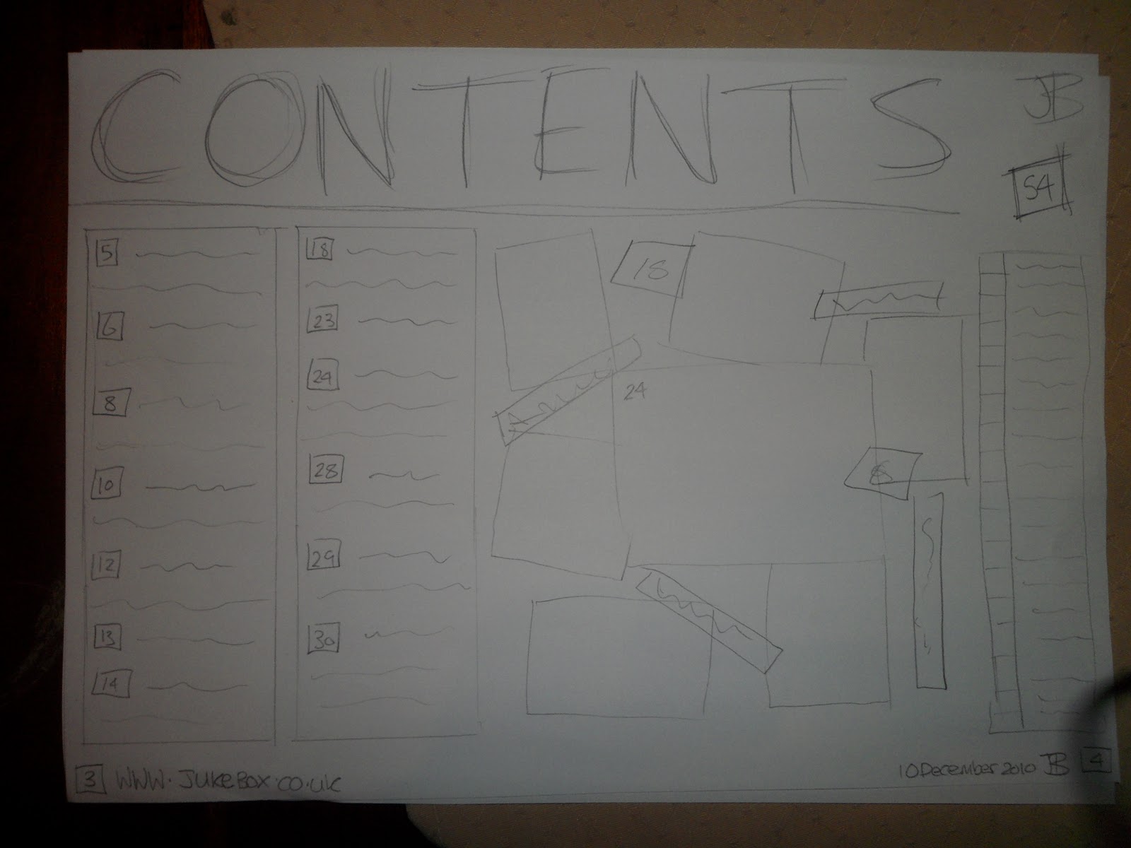
8. Is the layout of the contents page clear and easy to use?
Yes: 10
No: 0
I wanted to keep a simple layout on the contents page so that its easy to use which my target audience think I achieved very well.
9. Is the contents page attractive to look at?
Yes: 9
No: 1
The person who didnt think that it was attractive to look at suggest that it needs more colour as the backgrouund is totally white making it look quite plain and boring- I agree with this and should have used a light coloured background colour.
10. Does the contents page resemble a page from a music magazine?
Yes: 10
No: 0
I aimed to use the same layout as Q magazines contents page which my target audience picked up on and recognized.
11. Is the content of the article of interest to you?
Yes: 9
No: 1
The one person who wasnt interested in the article content said it was because its not their type of genre that they like.
Info about artist
Tells you a lot about the artist
Not their music taste
Interesting info about artist/ Q & A easy to use
Likes Q & A
Interesting to know the answers of what she thinks
Detailed information
Allows you to find out personal info about artist
Interesting to read
Not their ideal genre but likes Q & A
90% of my target audience liked the Q & A format mainly because it allows them to find out information and personal things about the artist.
12. Does the headline make you want to read the article?
Yes: 8
No: 2
I think the use of a quote from the article itself as the masthead gives and idea of what to expect to read which either makes it attractive to a certain auidence the 80% of my target audience or unappealing which the 20% of my target audience thhought, perhaps because It sounds a bit girly.
13. Does the main picture represent the content of the article successfully?
Yes: 10
No: 0
I used the picture with the article because it shows the artists cheeky/ fun side which links with the content of the article which represents this personality well as supported by my target audience.
14. How would you rate the layout of the article? 1: Bad 5: Good
4: 6
5: 4
The rating we're all in the top end of the rating scheme so shows that the layout for the article is successful.
15. Would you buy the magazine for the cover price?
Yes: 8
No: 2
I think the cover price is quite cheap compared to Q magazine which is £3.99 the people that said they wouldn't buy it for the cover price said it was because it's not the genre they are intersted in so wouldn't want to buy it and because they would buy it for £1.50
16. How would you rate the overall quality of the front cover, contents page and double page spread? 1: Bad 5: Good
5: 5
4: 3
3: 1
3.5: 1
I think I succeeded in producing a good quality magazine as 50% gave me top marks.
Tuesday, 3 May 2011
Wednesday, 27 April 2011


Monday, 25 April 2011


Sunday, 10 April 2011


Saturday, 9 April 2011


Thursday, 7 April 2011

Wednesday, 6 April 2011

Saturday, 5 March 2011

Wednesday, 2 March 2011

Tuesday, 1 March 2011


Saturday, 26 February 2011


2nd lot of photos for contents page


Date and time. | 26th February |
Image Description | Boy Band |
Shot location | Village Counrtyside |
Props | Costume |
Plan of shots | Sat/ stood on wall |
Photos for contents page


Date and time. | 26th February |
Image Description | Solo indie-pop artist |
Shot location | Village Counrtyside |
Props | Costume |
Plan of shots | ^^^photos above^^^ |
Friday, 18 February 2011
First draft content pages

The main larger image would proberbly be of 'Emma' with a picture of her new CD in one of the corners.
I prefer this idea so will proberbly use it.
I like the collage of picures and breif information on the right of this idea.
I don't like this idea as much as the other one but might include some of its features like the collage in the first idea.
Wednesday, 16 February 2011
More articles I like

I also like the picture collage on the left side giving an overview of what to expect inside the magazine and to tell you what page that article is on.

They also use sub headings n the right for readers different intrests which I think is good because some fans may want to look straight at the reviews making it easier and quicker for them to access.
Monday, 14 February 2011
An Article I like

I like this contents page because the colour scheme is similar to mine, the layout I also like because of the way the writting is listed down the sides and the pictures are put mainly in the middle like a scrapbook.
Wednesday, 9 February 2011

Monday, 7 February 2011

Monday, 31 January 2011


Monday, 3 January 2011

First ideas for article

I like the masthead for this idea but the picture doesnt really fit in with it.

 I have chosen this idea to use as my article layout because the masthead and the image fit well together. The masthead was also the most popular choice.
I think this idea is a bit too girly for a magazine mainly aimed at boys
Masthead ideas
1. “I’m not always this loud” 111
2. The wild child 1
3. “This is just the way I am and nobody will change me”
4. “I’m here to stay” 111
5. “YouTube was just a bit of fun- I never thought I’d become famous” 1
6. Move over Ellie Goulding- Emma’s here to stay 111
7. “Sleep all day party all night” 111111
8. “If someone doesn’t like me- I really don’t care” 11
9. “I am the only one of my kind” 1
10. Inspired by _______- Emma plans to take over the music industry
I asked ten people to vote for their two favourite mastheads for my article (1= one vote)
"Sleep all day, party all night" won with 6 votes
Subscribe to:
Comments (Atom)